Mobile & Web Development / Product & UX Design
Makeup Playbook
Founded, designed, developed, and marketed Makeup Playbook. An all encompassing social platform for beauty enthusiasts available on iOS, Android, and web.
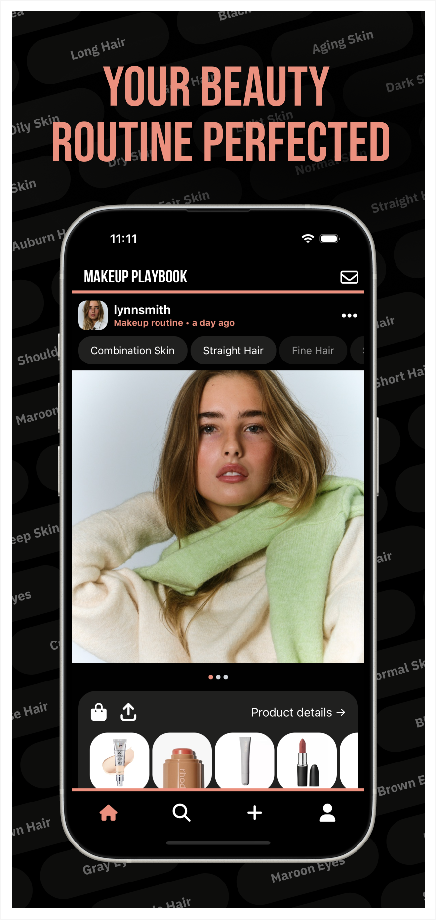
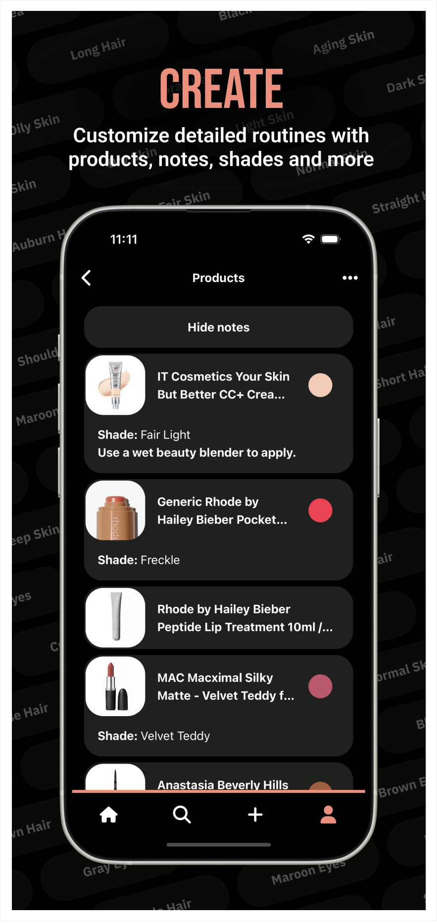
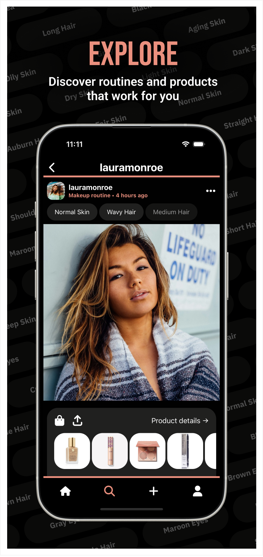
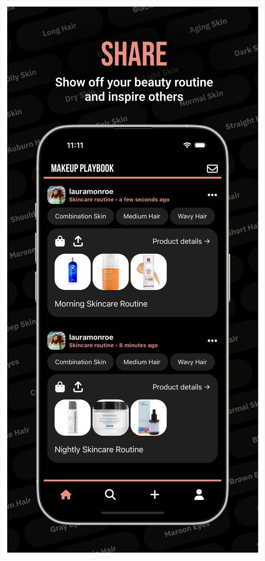
I designed and developed Makeup Playbook, a social platform for the beauty community, enabling users to create, manage, and share personal care routines for makeup, skincare, and haircare. The platform includes a mobile app for iOS and Android, built with React Native, and a web app developed in Next.js, both leveraging TypeScript and Tailwind CSS for a seamless and responsive user experience. The mobile app provides an engaging social experience with features like personalized feeds, user profiles, routine sharing, and discovery tools. Meanwhile, the web app allows users to effortlessly share their routines and profiles beyond the app, ensuring accessibility across all devices. By integrating Firebase for the backend, Firestore for real-time data, and Algolia for search, I built a scalable and performant ecosystem that connects beauty enthusiasts through shared routines and product recommendations.
Mobile App Development / Product Design
News Application
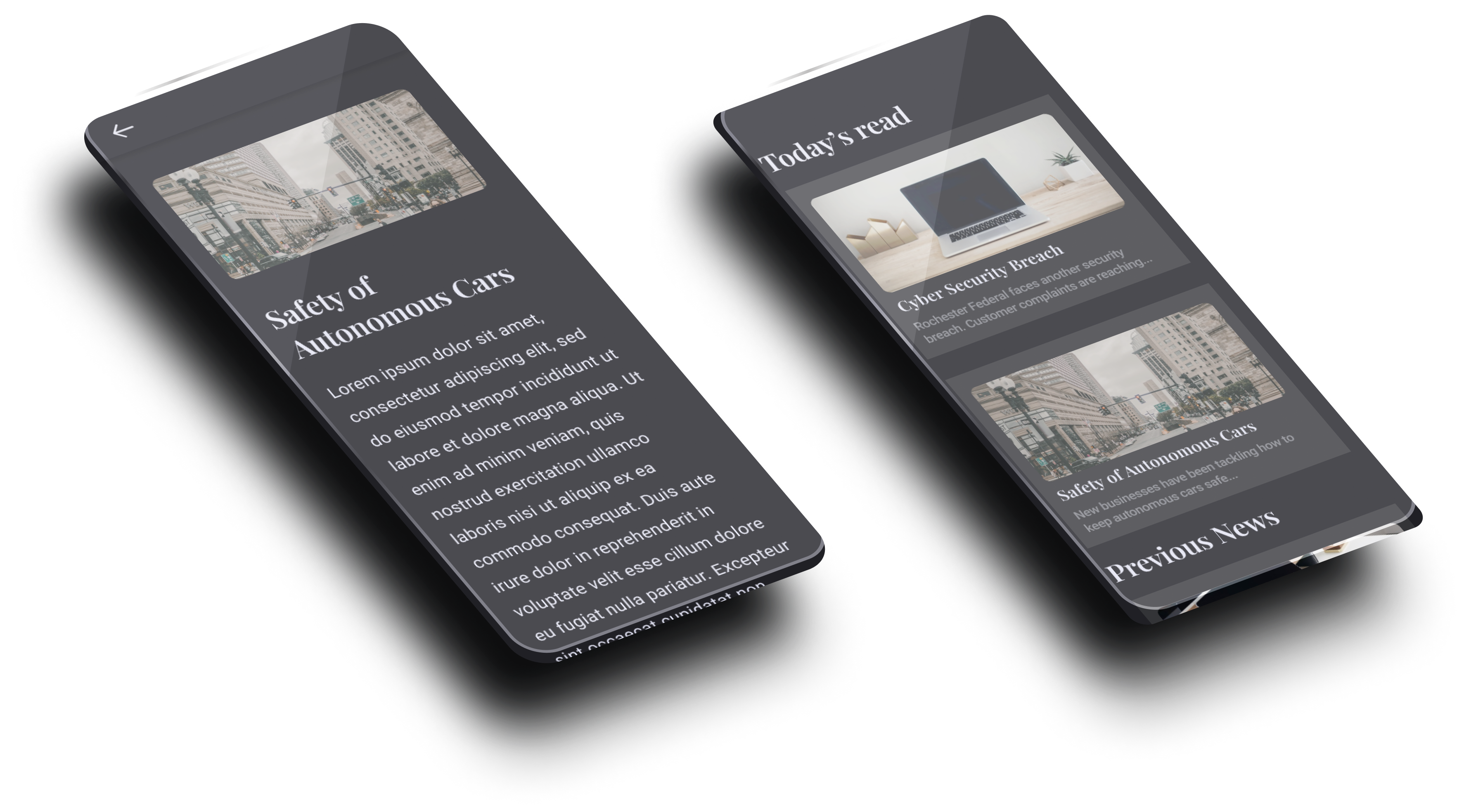
As a developer for a Cyber Security Bootcamp, I headed the development of a mobile application to display news articles. I first used Figma to create high fidelity mockups then developed the application using React Native.
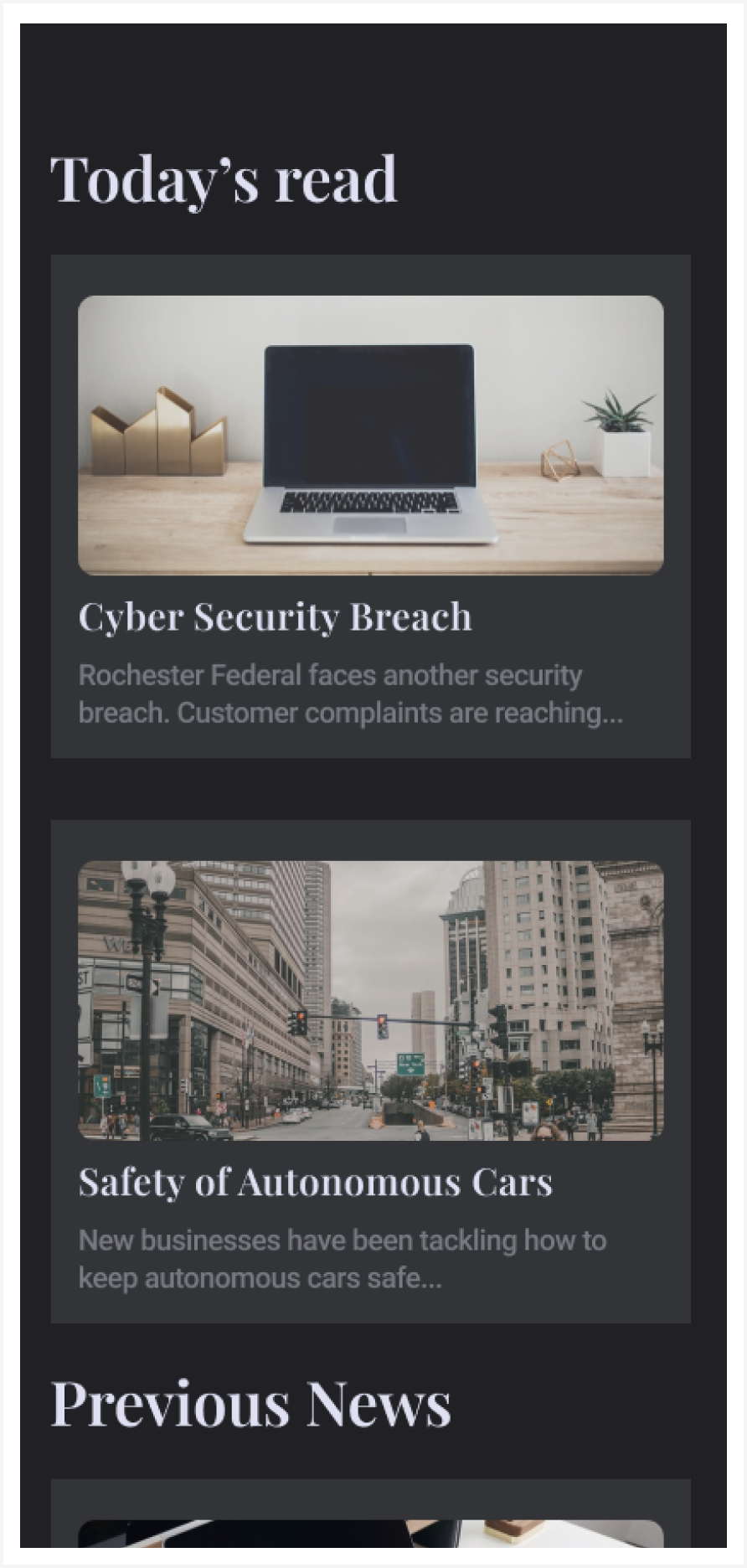
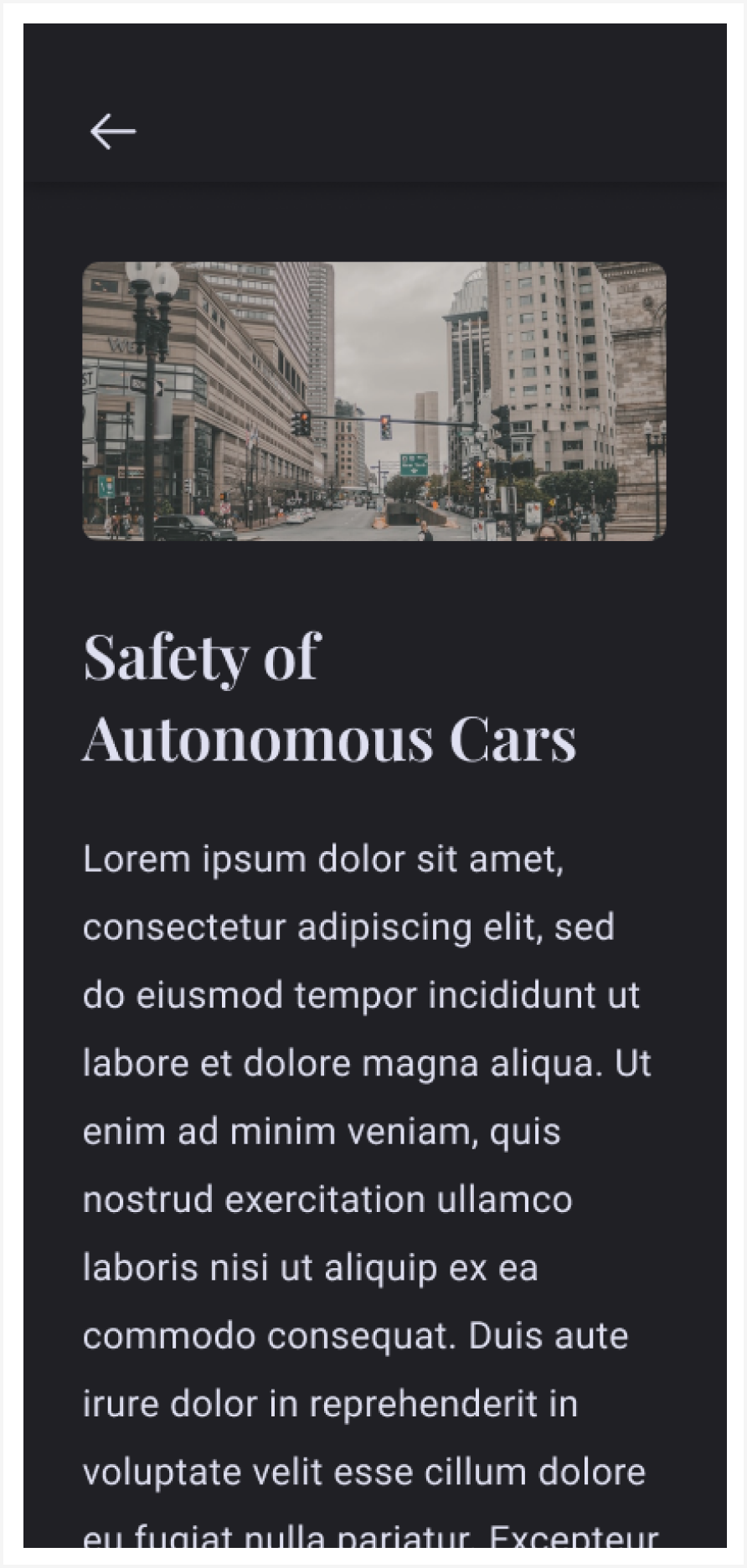
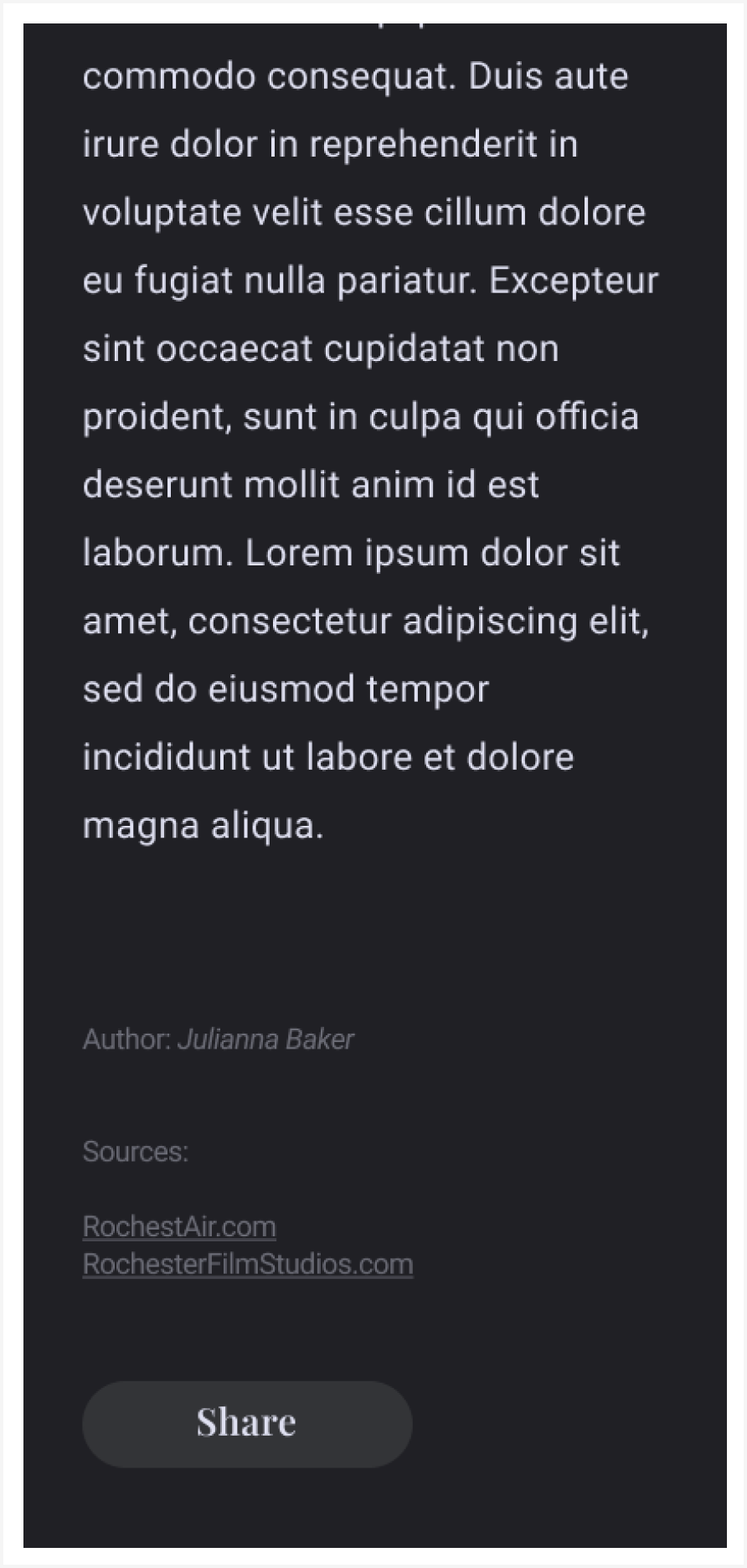
After analyzing the results of user surveys, I identified a problem that students were not reading the content we were giving them. I took initiative to create simple and clean mockups for an application to replace the current delivery method. I used this and an MVP I coded in React Native to pitch the idea to the program directors. The project was green lit.
Web Development / Product Design
Pixo Multisites
Our client needed a new multisite where they can update content dynamically, have a site that is accessible, and stay on brand and aesthetic. I helped work on this project’s deliverables, creating a modern wordpress multisite. To achieve these deliverables we have a design system that specifies unique font and color values as well as component layouts that can be applied to many sites and customized with css variables. This gives each site a unique feel while being a part of the same design family. I helped develop pages within this multisite using accessible content types and components that help make creating content easy for content authors.

To streamline our development we use a starter kit created by Pixo’s engineering team. I helped contribute to this starter kit by developing components that can be used across multiple websites and be easily reused and styled.

Android App Development / Product Design
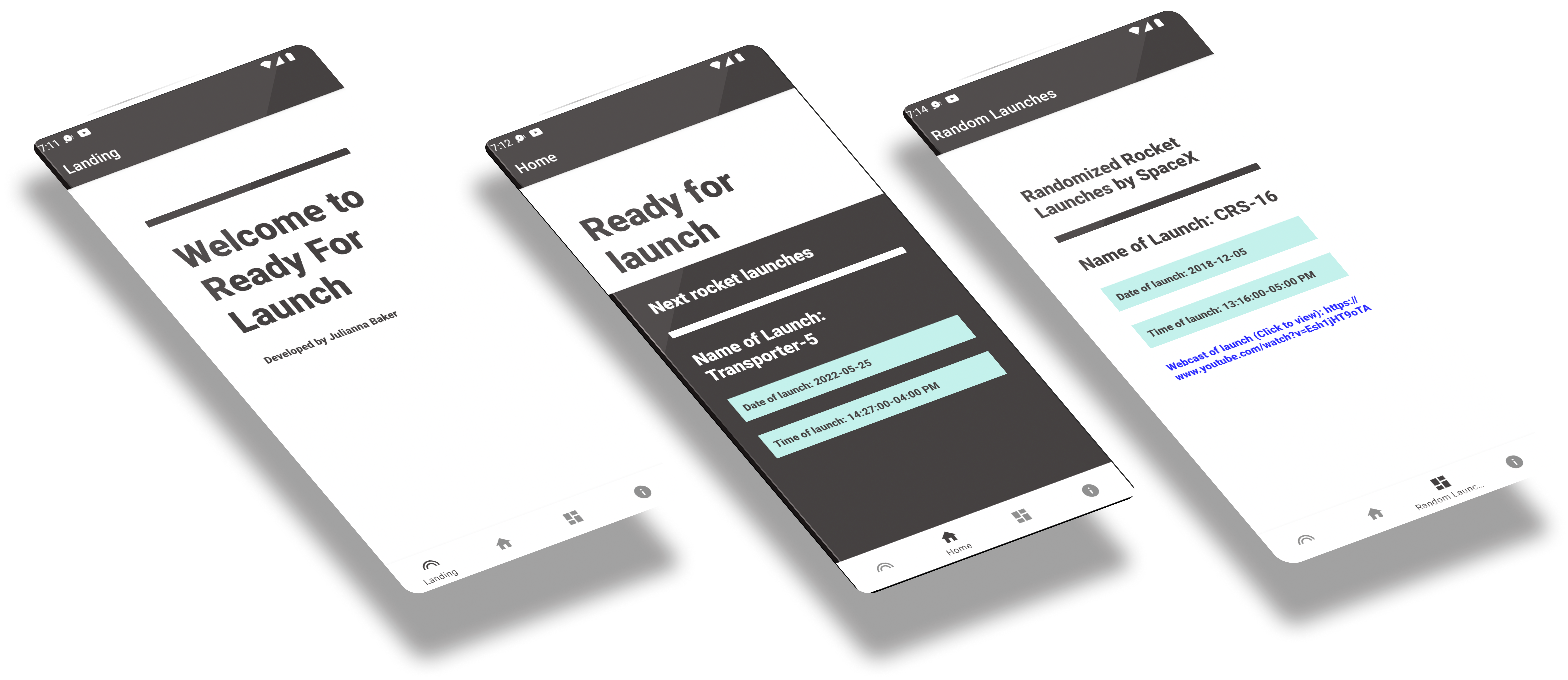
Ready for launch
It is very difficult to see when rocket launches will happen. Growing up my Dad always tracked rocket launches. He would wake me up on a school night at 3am, drive to the nearest wide open field, and look into the sky to see the launch. I asked him how he finds out about these launches and realized how challenging it can be. I knew creating an app that had all the resources in one place would help my Dad. This would possibly help other people interested in SpaceX/NASA rocket launches as well.


I decided to make a few mockups in Figma to get a sense of how it would look, and I began coding. I chose Kotlin to learn more about the language and how to develop for android phones. I also chose this language since my Dad only uses android phones and he was my target audience. I also used a SpaceX API to display upcoming rocket launches and to give the user the link to the broadcast when it goes live.
UX Design / UX Research
Interpreter Request Application
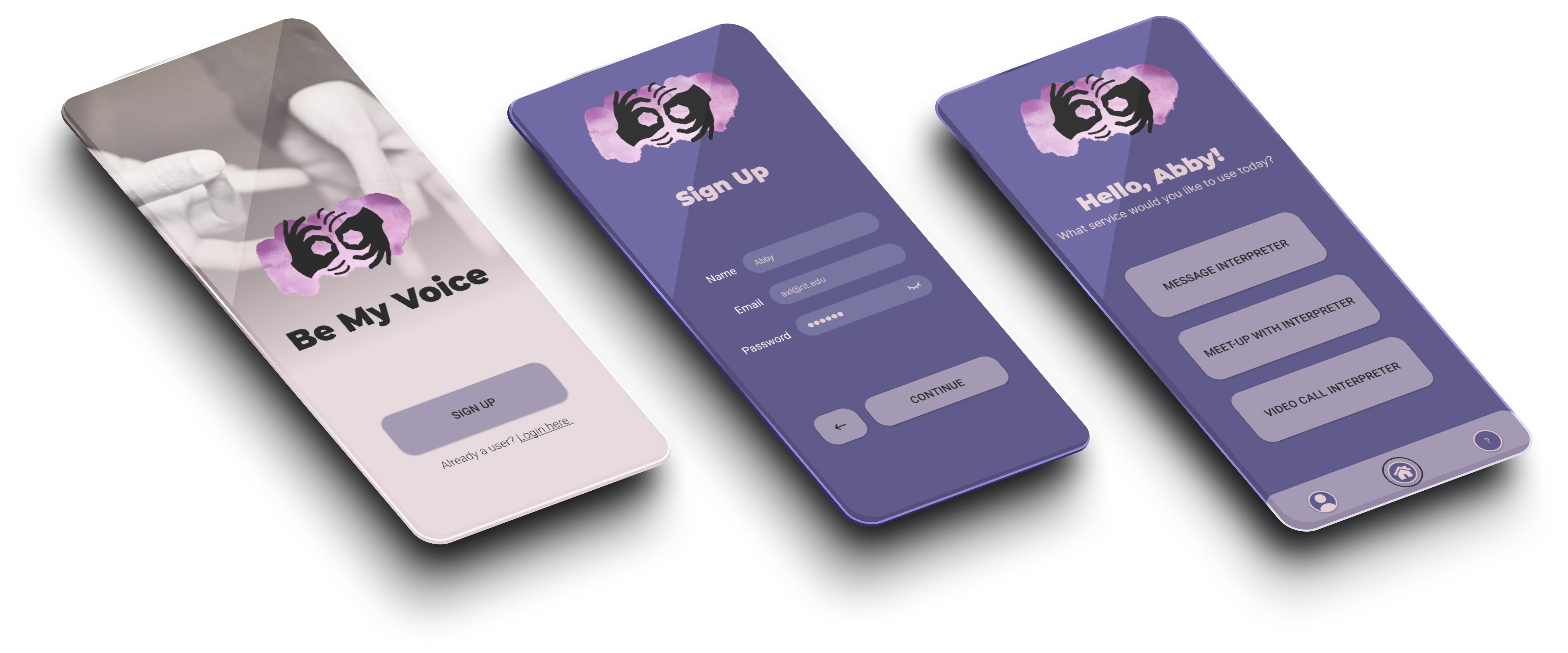
I designed a complete high fidelity prototype that was implemented through multiple usability tests and user surveys to reach a user friendly design. This design is ready to be further developed after finding that there is a large audience that would use this application from multiple user surveys.
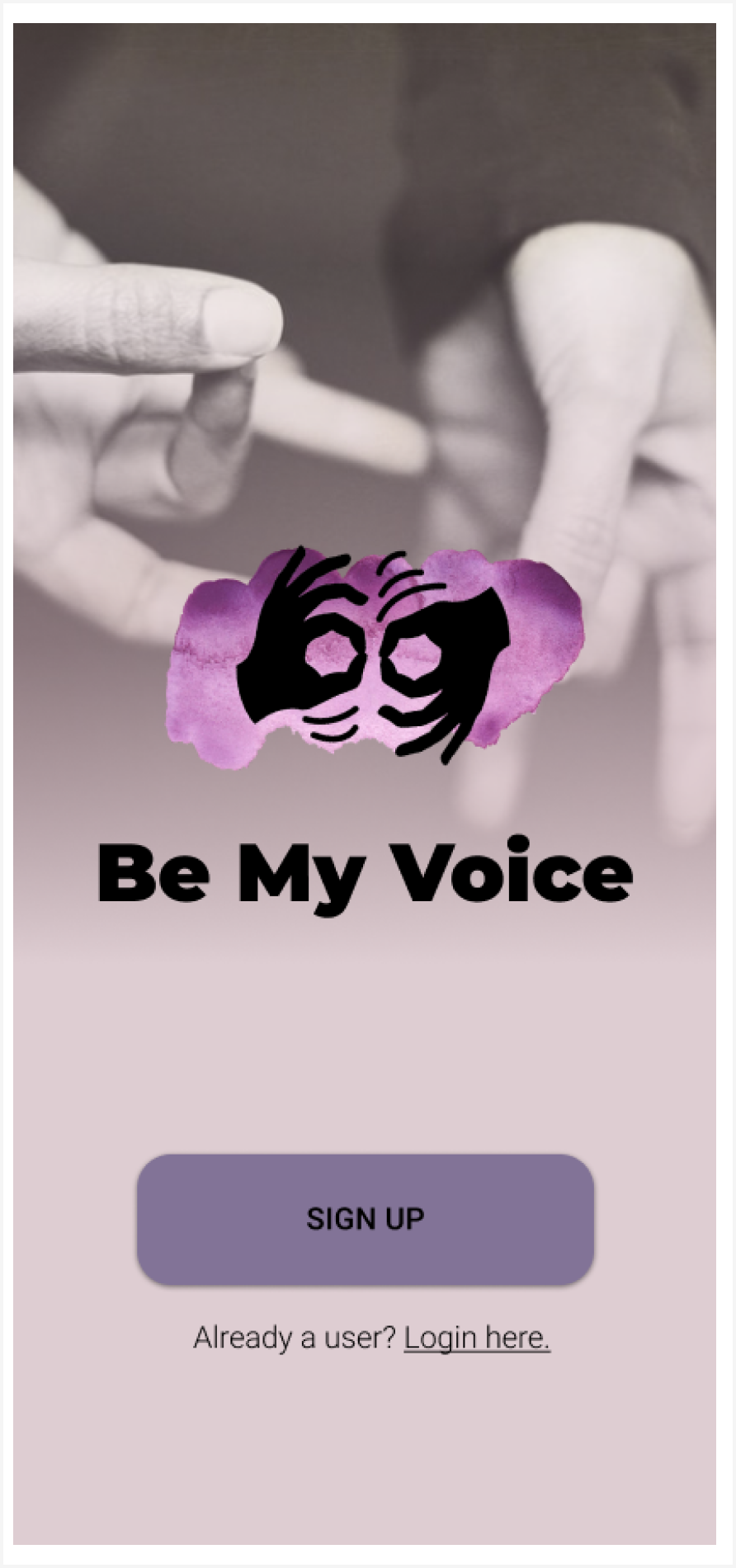
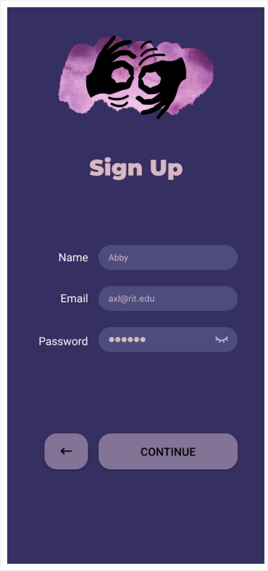
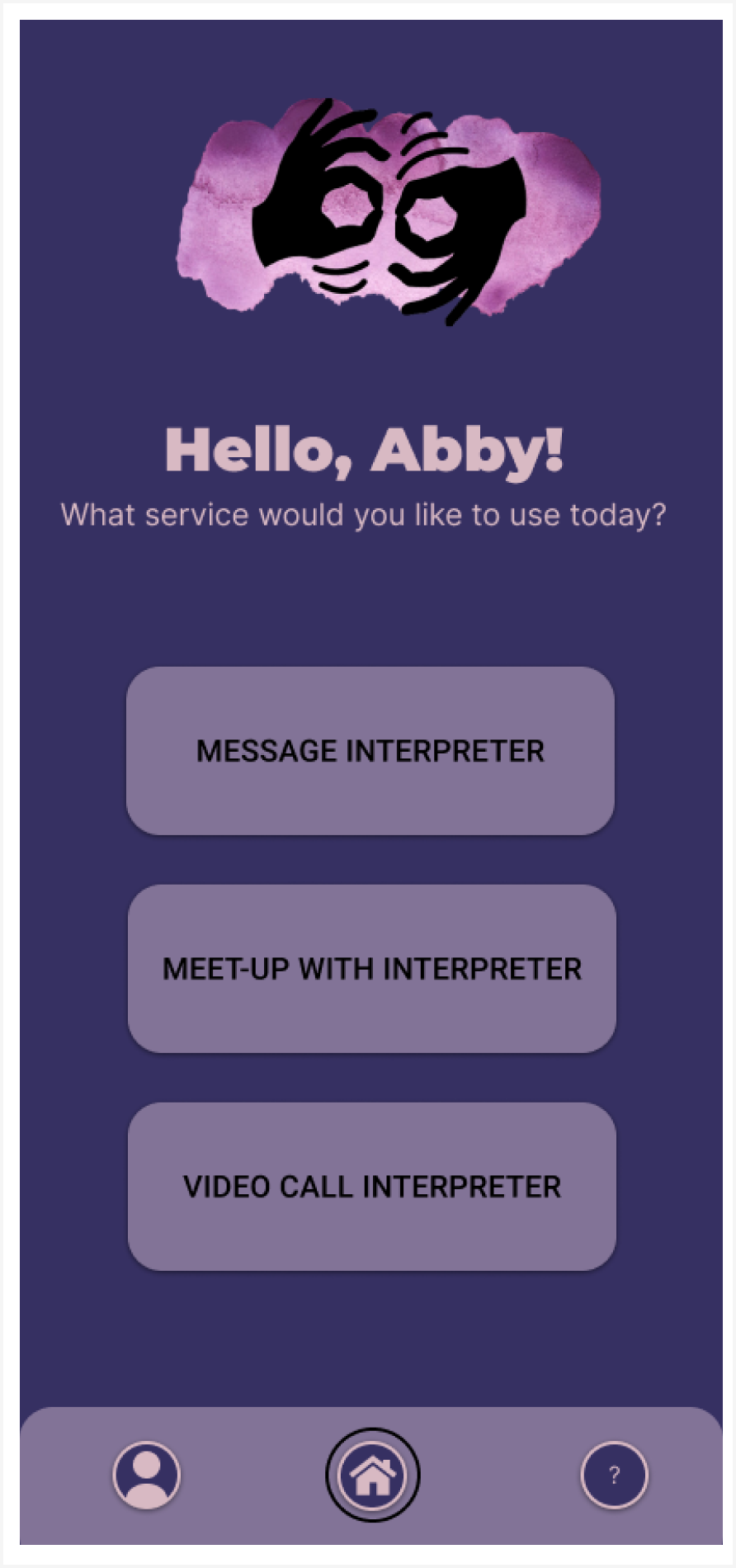
After speaking with multiple people from the deaf/hard-of-hearing community and many interpreters around the Rochester Institute of Technology campus there was a need for a service that would link students with interpreters.
UX Design / UX Research
ISM Website Redesign
I worked for ISM to redesign a website that is user-focused and user-friendly. I conducted personas, heuristic evaluations, competitive analysis, created an information architecture diagram, and designed the webpage based on my research and understanding of the client.

In the span of a week I needed to do research and come up with a new design for ISM’s membership webpage. I decided to create style guides in a Figma Design File and I started to ideate and design my mockups and prototype the mockups to present my hi-fidelity working prototype to ISM’s developers and design team.

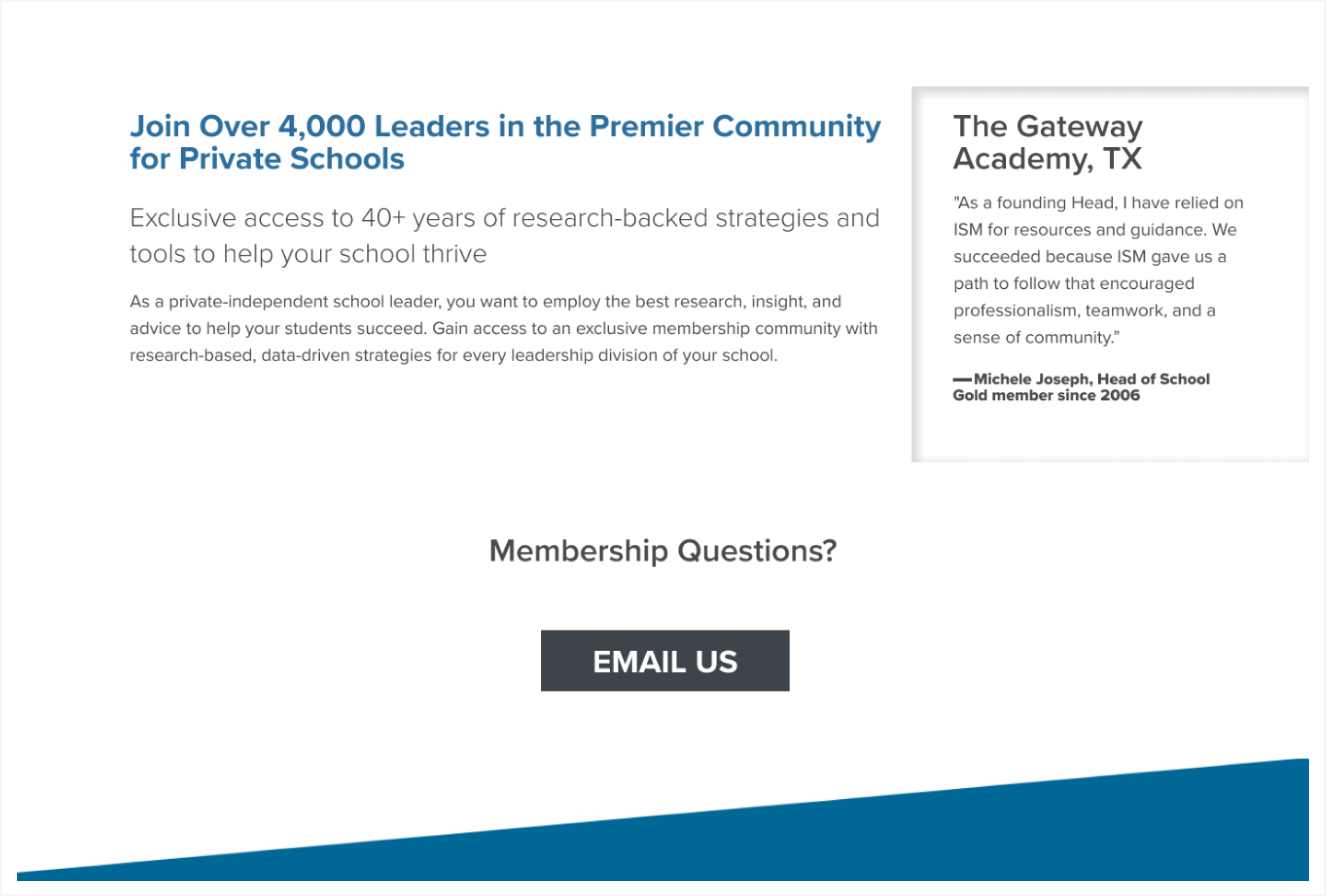

Throughout this project I used a design process shown in my presentation (Click “Learn More” to find these slides). After product research, user research, understanding the problem, and competitive analysis I came to my ideation phase of the design process where I used a sticky note method to organize ideas and I also used an information architecture diagram I quickly drew up so that I was able to figure out a better order of information. After I was able to understand who the target user was and figure out a heuristic evaluation of the current website I was able to change the order of information to better suit the user.


